The Data Mine reports is an evolving feature. There are three basic data types:
- Numbers
- String
- List of strings
Reports currently exist for Numbers and List of strings.
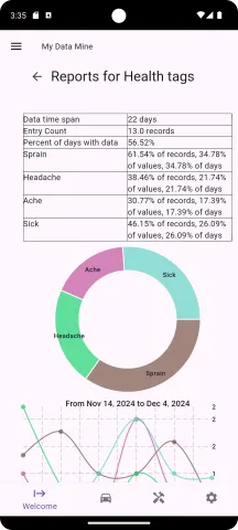
List of strings
The report focuses on the number of times a particular string option is used (count).
Pie chart
The pie graph is used to show how often each option is used. Selecting an option on the pie graph will cause the option to be highlighted in all the following charts. This can aid in seeing how an option is used over time.
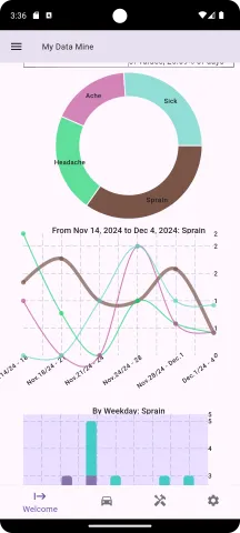
Curved line graph (all data)
The curved line graph shows the data distribution over time. The graph compresses all the data into a single chart and will automatically adjust as the time frame of data collection increases. It provides a high level view of the data over its lifetime.
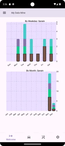
Barcharts, by weekday and by month
The data is broken down by weekday and month.
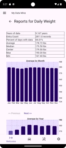
Numeric reports
For data type of number, the reports focus on the average of the values.
Bar charts
Average by month: Data is divided by month
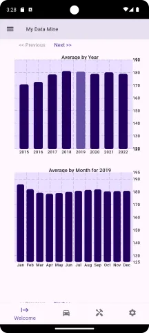
Average by Year: Data is divided by year. Selecting a year will update the following chart "Average by Month" to show the data by month for the selected year.
Average by Month for year: Data is grouped by month for the selected year.
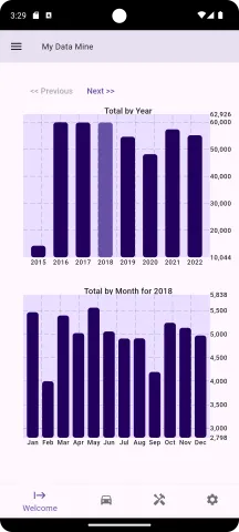
Total by year: Data is totaled by year. Selecting a year will display the totals for selected year by month.
Total by Month for the year: Data is totaled by month for the selected year.